Notes on Watchmen
About this project
A companion for looking more closely at the structure beneath Watchmen.
What
Notes on Watchmen is made for readers who have the book beside them or are familiar with the novel. This site does not reproduce complete pages or present a replacement reading experience. Its panel diagrams and colorizations are abstract records of the book’s composition and color.
If this project works, reading this site will fill you with a sudden urge to grab Watchmen off the shelf and enjoy once again, this time noticing something you had not seen before.
Why
During the COVID lockdowns, I had an idea that everything within the pages of Watchmen could be repsented as JSON metadata: chapters, pages, panels, character appearances, symbols, colors, and connections. And if that data existed, I could build a site to display it, explore it, move through it, find patterns in it, and analyze it.
One unlikely inspiration for the project is Red Letter Media’s Star Wars: The Last Plinkett Review, a long, scathing dismantling of The Last Jedi. At one point it offers a useful explanation for how craft reaches us: “You might not have noticed, but your brain did.” The review patiently identifies the choices behind a movie that feels wrong. I want to attempt the same move in the opposite direction—not a dismantling, but an assembly. I want to identify the choices that make Watchmen feel so astonishing even before I can explain what they are doing.
This happens outside criticism all the time. A room can feel calm before I notice the repeating lines and balanced spaces; a piece of music can feel inevitable before someone points out the phrase returning underneath it. Naming the construction does not replace the original feeling. It gives me a way back into it, now with a richer understanding of why it happened. That movement—from felt craft to observed craft—is what I want these notes to offer: not just more things to notice in Watchmen, but a clearer view of why noticing them deepens the experience of reading it.
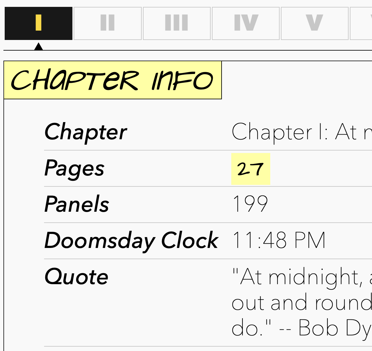
From there, I started creating the JSON metadata for each chapter. Carefully reading and documenting every page, panel, and character appearance, until eventually I had all 12 chapters in 12 JSON files, 3,000+ lines each. Then I started prototyping a system for displaying the page panel grids and creating specific design elements to give the site a Watchmen vibe. I spent weeks writing code to parse JSON, scripts to extract color data from images, solutions for auto-cropping panels from pages, and experimemting with techniques to display all this data on the page.
Chapter prototype
Basic page prototype
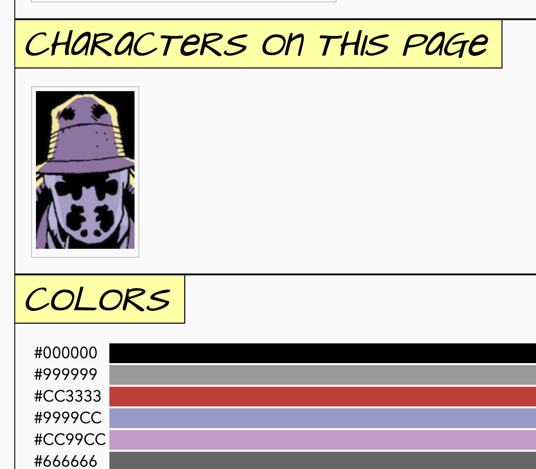
Of course, when COVID ended and we all went back to our lives, this project sat dormant for years until I picked it up in the summer of 2026. Armed with a new laptop, an OpenAI Pro subscription, and a renewed inspiration to finish what I started, I revived the project.
How
1. Describing the book in JSON
The source data lives in JSON records for chapters, pages, panels, characters, and colors. A panel has a stable ID such as panel-07-17-05, so its position can be connected to its characters, chronology, tags, image crop, and color histogram without copying those facts into every view.
Here is an excerpt from Chapter VII, page 17:
{
  ...
  "page_num": 17,
  "layout": 9,
  "panels": [
    {
      "panel": 5,
      "width": 0.5,
      "chronology": "present",
      "characters": ["dan_dreiberg", "laurie_juspeczyk"]
    }
  ]
  ...
}
Once the information is structured, it can answer questions that would be tedious to track by hand. It can show where the nine-panel rhythm breaks, or trace shared panels and color clusters by character or chapter. A single record can generate a page diagram or feed a chart. It can also provide context for a close reading. The data opens up opportunities to make connections and notice trends.
2. Page grids
The page diagrams went through two main implementations. The prototype used nested HTML tables because rowspan and colspan map naturally to panels that occupy several units of the familiar three-by-three structure. A small set of CSS classes covered three- and four-column layouts, double-height panels, and scales ranging from tiny navigation thumbnails to full-page diagrams. The same table could then be reused at several sizes.
Here is an excerpt of the original page panel data:
  "id" : "page-01-01",
  "col_layout" : 3,
  "page_num" : 1,
  "title" : "Chapter 1, Page 1",
  "panels" : [
    [
      {
        "tags" : [
          "happy_face"
        ],
        "id" : "panel-01-01-01",
        "panel_color_id" : "panel-01-01-01"
      },
      {
        "tags" : [],
        "id" : "panel-01-01-02",
        "panel_color_id" : "panel-01-01-02"
      },
      {
        "panel_color_id" : "panel-01-01-03",
        "id" : "panel-01-01-03",
        "tags" : [
          "the_end_is_nigh"
        ]
      }
    ],
Page grid prototype
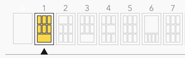
Tables were quick to build and worked well enough for most regular pages, but I didn’t account for several edge cases.
Table prototype
Normalized CSS Grid
The current renderer separates the page grid model from its presentation. It starts with a base grid: three rows, and a column count derived from the page’s declared layout. A standard nine-panel page therefore begins as three columns by three rows. The generator reads each panel’s width and height, finds the least common multiple of any fractional denominators, and increases the track resolution until every size is an integer. On page 17 above, halves turn the three base columns into six tracks. Normal panels span two columns, allowing panels 5 and 6 to span one each.
Here you can see the grid for Chapter 7, Page 17 represented in the data. The half-width panels in the middle force the base grid to 3 rows by 6 columns, forcing all other panels to use "column_span" : 2 even though they appear as normal width columns relative to the rest of the book.
      "grid" : {
        "columns" : 6,
        "rows" : 3,
        "items" : [
          // Due to the 6 column base grid, the "normal"
          // sized panels 1-4 use column_span: 2
          {
            "panel_color_id" : "panel-07-17-01",
            "type" : "panel",
            "row_span" : 1,
            "column" : 1,
            "row" : 1,
            "panel_id" : "panel-07-17-01",
            "panel" : 1,
            "column_span" : 2
          },
          {
            "type" : "panel",
            "panel_color_id" : "panel-07-17-02",
            "row" : 1,
            "row_span" : 1,
            "column" : 3,
            "panel_id" : "panel-07-17-02",
            "column_span" : 2,
            "panel" : 2
          },
          {
            "row_span" : 1,
            "column" : 5,
            "row" : 1,
            "panel_color_id" : "panel-07-17-03",
            "type" : "panel",
            "panel" : 3,
            "column_span" : 2,
            "panel_id" : "panel-07-17-03"
          },
          {
            "column" : 1,
            "row_span" : 1,
            "row" : 2,
            "panel_color_id" : "panel-07-17-04",
            "type" : "panel",
            "panel" : 4,
            "column_span" : 2,
            "panel_id" : "panel-07-17-04"
          },
          // The two half-width panels in the middle
          // use column_span: 1 since the base grid is 6 columns.
          {
            "column_span" : 1,
            "panel" : 5,
            "panel_id" : "panel-07-17-05",
            "row" : 2,
            "column" : 3,
            "row_span" : 1,
            "type" : "panel",
            "panel_color_id" : "panel-07-17-05"
          },
          {
            "row_span" : 1,
            "column" : 4,
            "row" : 2,
            "panel_color_id" : "panel-07-17-06",
            "type" : "panel",
            "panel" : 6,
            "column_span" : 1,
            "panel_id" : "panel-07-17-06"
          },
          ...
        ],
      }
Panels are then placed in reading order into the first open region large enough for their calculated row and column spans. Fractional panels can appear vertically as well as horizontally. Chapter VII, page 28 ends with two panels stacked in the final column. Panel 9 occupies two-thirds of the usual bottom-row height, and panel 10 occupies the remaining third. The source JSON describes those proportions directly:
{
  "page_num": 28,
  "layout": 9,
  "panels": [
    {
      "panel": 9,
      "height": "2/3"
    },
    {
      "panel": 10,
      "height": "1/3",
      "exclude_color_analysis": true
    }
  ]
}
The table renderer copied those values into rowspan. Because HTML only accepts a whole number there, the browser could not divide one standard row into thirds. It rendered panels 9 and 10 as ordinary cells and broke the bottom of the page.
Table prototype
Normalized CSS Grid
For the CSS grid version, a post-processing script converts the panel metadata into normalized grid data for the renderer:
{
  "rows": 9,
  "columns": 3,
  "items": [
    {
      "panel": 9,
      "column": 3,
      "row": 7,
      "column_span": 1,
      "row_span": 2
    },
    {
      "panel": 10,
      "column": 3,
      "row": 9,
      "column_span": 1,
      "row_span": 1
    }
  ]
}
3. Building with Hugo
Hugo is a particularly good fit for the project. The book is a fixed corpus, the relationships are computed ahead of time, and readers do not need accounts or live database queries. Perl scripts validate the source JSON and generate the chapter, page, character, grid, and color records and Hugo build those records and templates into static HTML.
That keeps the published site fast and portable while leaving the complicated work in a reproducible build pipeline. A bad panel reference or impossible grid can fail during generation instead of becoming an uncaught error in a browser.
4. Color data and masking
The color work begins with page scans to JPG files. ImageMagick converts them to PNG, and a multicrop script separates the pages into panel images. After cropping, the color processing pipeline reduces each panel to a fixed web-safe palette. That deliberate loss of precision gives the project a stable color palette. ImageMagick then emits a histogram of pixel counts. Perl scripts apply a small noise cutoff, calculate percentages, and write panel-level JSON. Those panel histograms can also be aggregated into page, chapter, and character palettes.
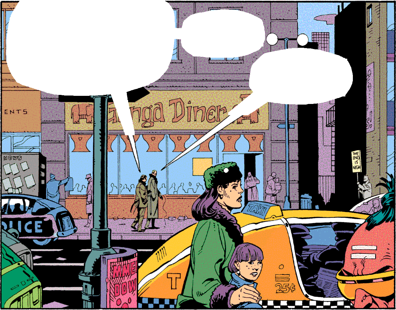
Of course, the color data wasn’t clean on the first pass. Black and white and pale yellow were disproportionately represented across the entire book because of all the dang dialog balloons. So the next challenge was to cut out all the text balloons before doing color counts. Detection is tricky because Watchmen uses circular and irregular balloons, rectangular captions, connected shapes, colored fills, and white architectural areas that must not be mistaken for text containers. Signs, newspapers, and lettering that belongs to the depicted environment should usually remain.
Enter the masking tool…
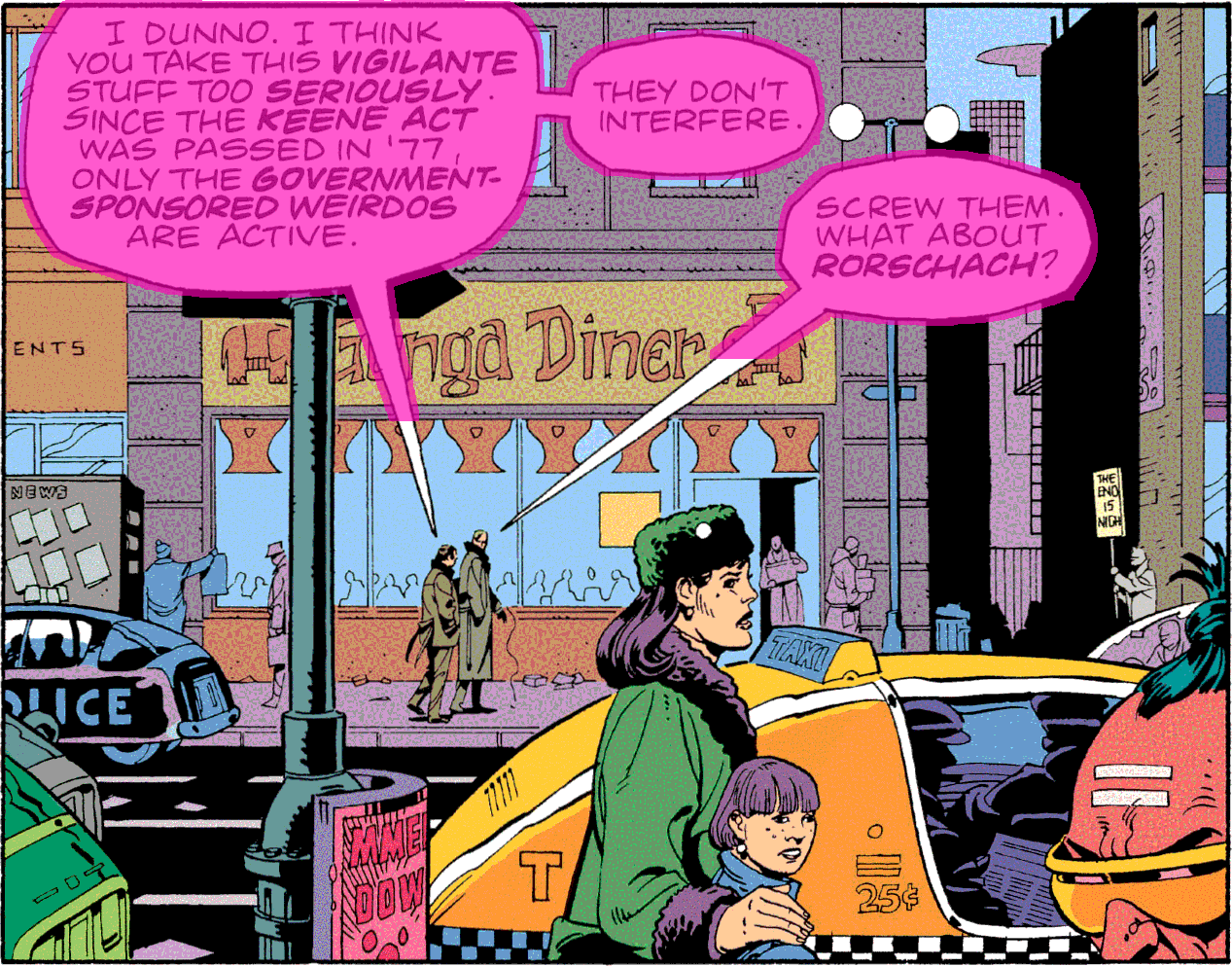
The masking tool is written in Swift and uses Apple’s Vision OCR to locate text. It groups nearby lines, estimates the local fill around each group, grows through connected pixels of similar color, and scores whether the result looks like editorial lettering rather than text inside the scene. Low-confidence and unusually large masks are flagged for review. High-confidence accepted regions are masked then cropped out before ImageMagick remaps the remaining panel to the web-safe palette.
Review overlay
Masked analysis input
5. Abstract color fills
The abstract fills are meant to evoke a panel’s palette without reproducing its drawing. The same percentages can be displayed as bands ordered by usage or placed in a consistent spectrum-like, rainbow order. In the randomized bubble view, an irregular field of circles still has to feel like the source palette while representing the data.
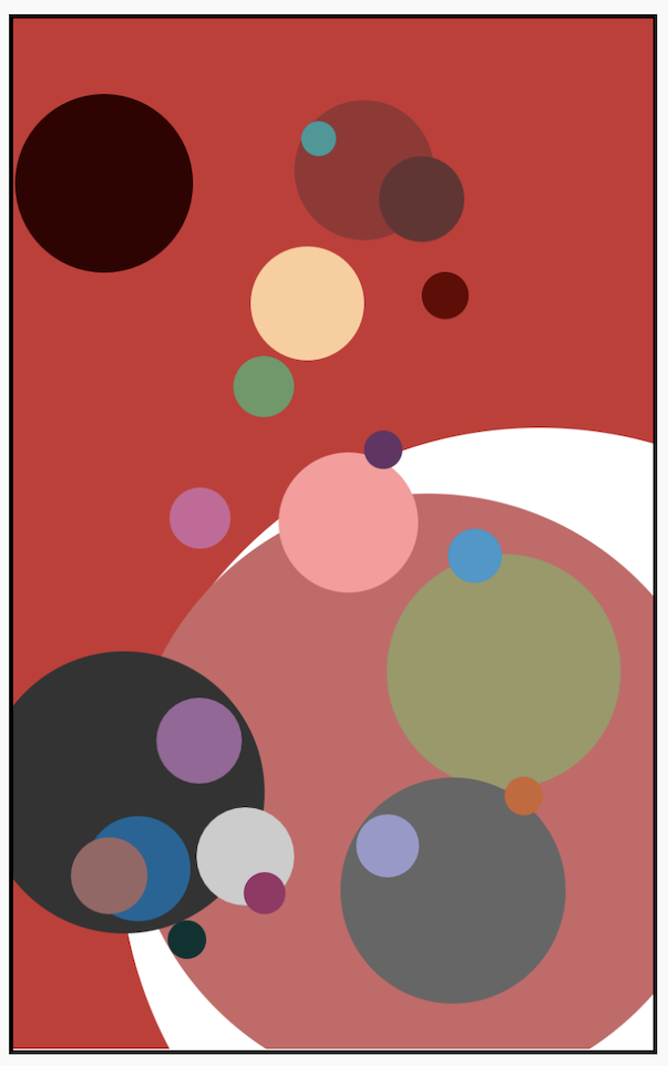
The earliest fill painted the most common color as the background, then drew one circle for every other color. That guaranteed inclusion, but a moderately common color could produce an enormous circle while a long tail of tiny colors became nearly invisible. Random placement also meant that circles could cover one another or land mostly outside a narrow panel.
At first glance, you wouldn’t notice, but I wanted every panel to show a true representation of its color palette. For example, here’s the initial prototype color fill for Panel-01-01-03 (Chapter 1, Page 1, Panel 3), a panel with primarily black, grey, and red.
Prototype color fill
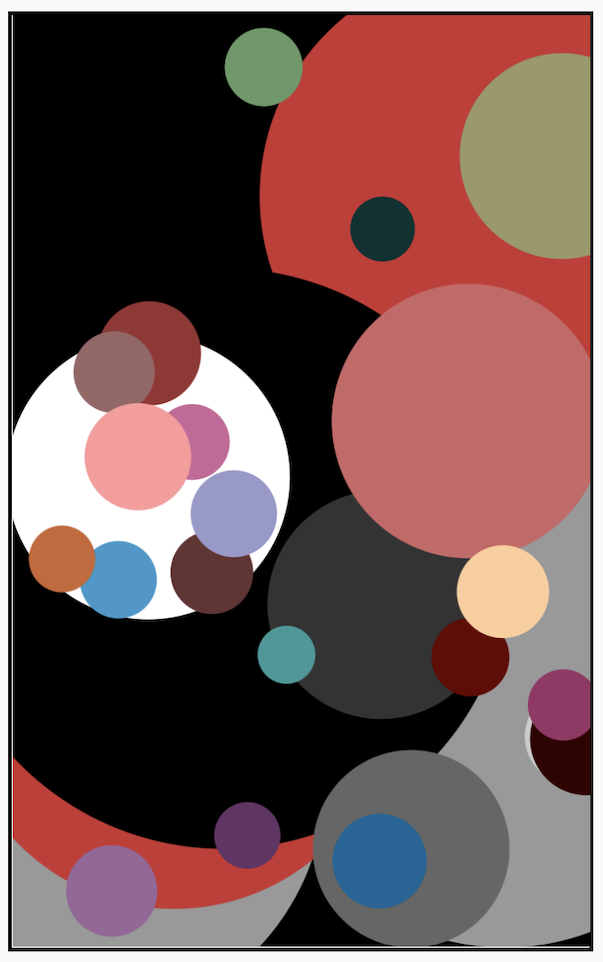
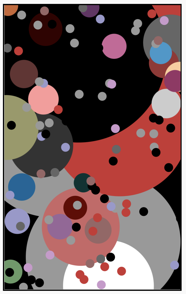
After several iterations of color fill algorithms, testing side by side, I settled on the current tiered-hybrid model. It creates three tiers of colors based on prevalence, then set parameters for circle size, location, and density. After fine tuning the parameters, I achieved the desired effect. The dominant colors fill the background and the remaining colors fill in the abstraction. Every retained color appears at least once. And to finish the look, there’s a sprinkle of circles based on the full page color palette.
Final color fill
Final color fill with page palette sprinkle.
8. Working with Codex
And here we get to the fun part: working with AI. I fired up Codex, pointed it to my initial prototype, JSON data files, and internal documentation about how it works and my goals for the final site. Within hours I had a working polished framework for the main chapter and page presentations.
Codex traced data through the Perl generators, Hugo templates, CSS, and JavaScript, then built the normalized panel grid and masking pipeline. It tested edge cases and fixed every bug I threw at it. I treated it as a collaborator my personal developer-for-hire.
So now we get to the “notes” part of the project. This is where I might lose some of you. Yes, all the chapter, page, and character notes are AI generated. Do I care? Not really. I read the notes and they make sense. They enriched my experience of the book. I found them interesting. Can you tell they were written by AI? Does knowing this ruin this site for you? Is this whole project now a soulless exercise? Not to me. I think you’ll enjoy it anyway, and most people won’t care.
Fair use
Notes on Watchmen is an independent, not-for-sale work of criticism, commentary, scholarship, and research. It is not affiliated with, endorsed by, or sponsored by DC Comics, Warner Bros. Discovery, or the creators and other rights holders associated with Watchmen.
Watchmen was created by Alan Moore and Dave Gibbons, with color by John Higgins. The title, character names, and other identifying references belong to their respective rights holders. They are used here only as needed to identify and discuss the work. This site uses limited references and abstracted analytical data, adds original interpretation, and is not a market substitute for the graphic novel.
Fair use is a fact-specific legal doctrine, not a status a disclaimer can create. The U.S. Copyright Office’s fair-use overview explains the four factors considered under U.S. law.